The Challenge
New restaurant Spring on Main was looking for a brand that evoked the travel destination of hey-day of Eureka Springs, Arkansas. Here is how I took their vision from concept to reality. After logo exploration, I made several concepts for the client. With their feedback, I found the right mix of vintage vacation and Ozark charm.
The Brand
Logo
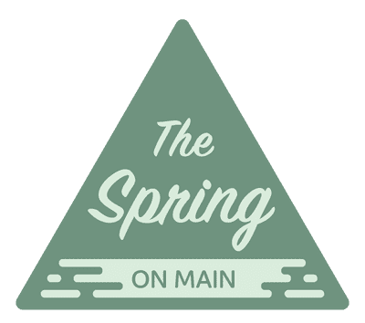
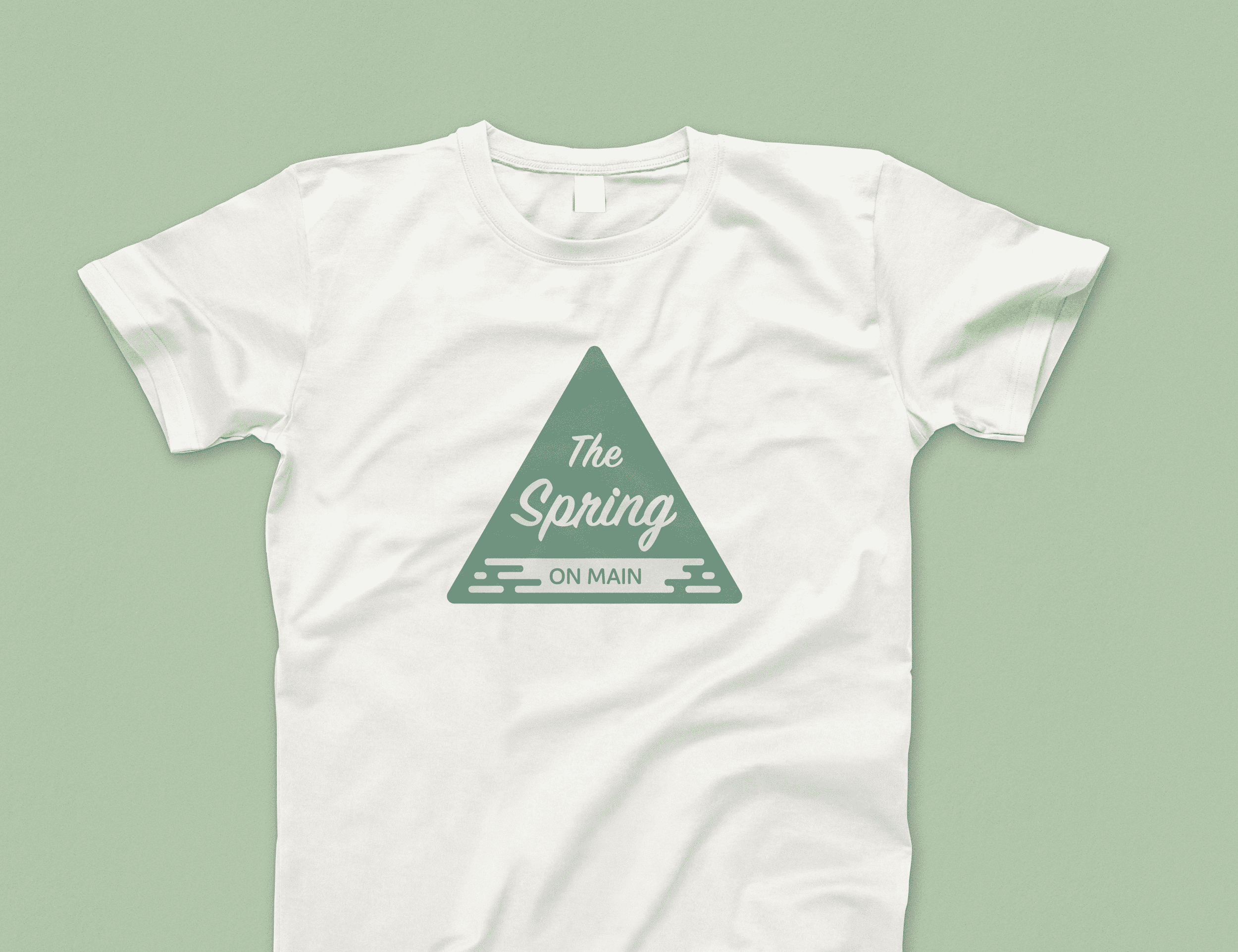
The logo makes use of stylized typography similar to that used in vintage travel advertising. The container is a nod to both the scenic Ozark Mountains and the natural springs for which Eureka Springs is named.
Color
6F937F
DAECDD
E16D53
F7CF74
141928
Typography

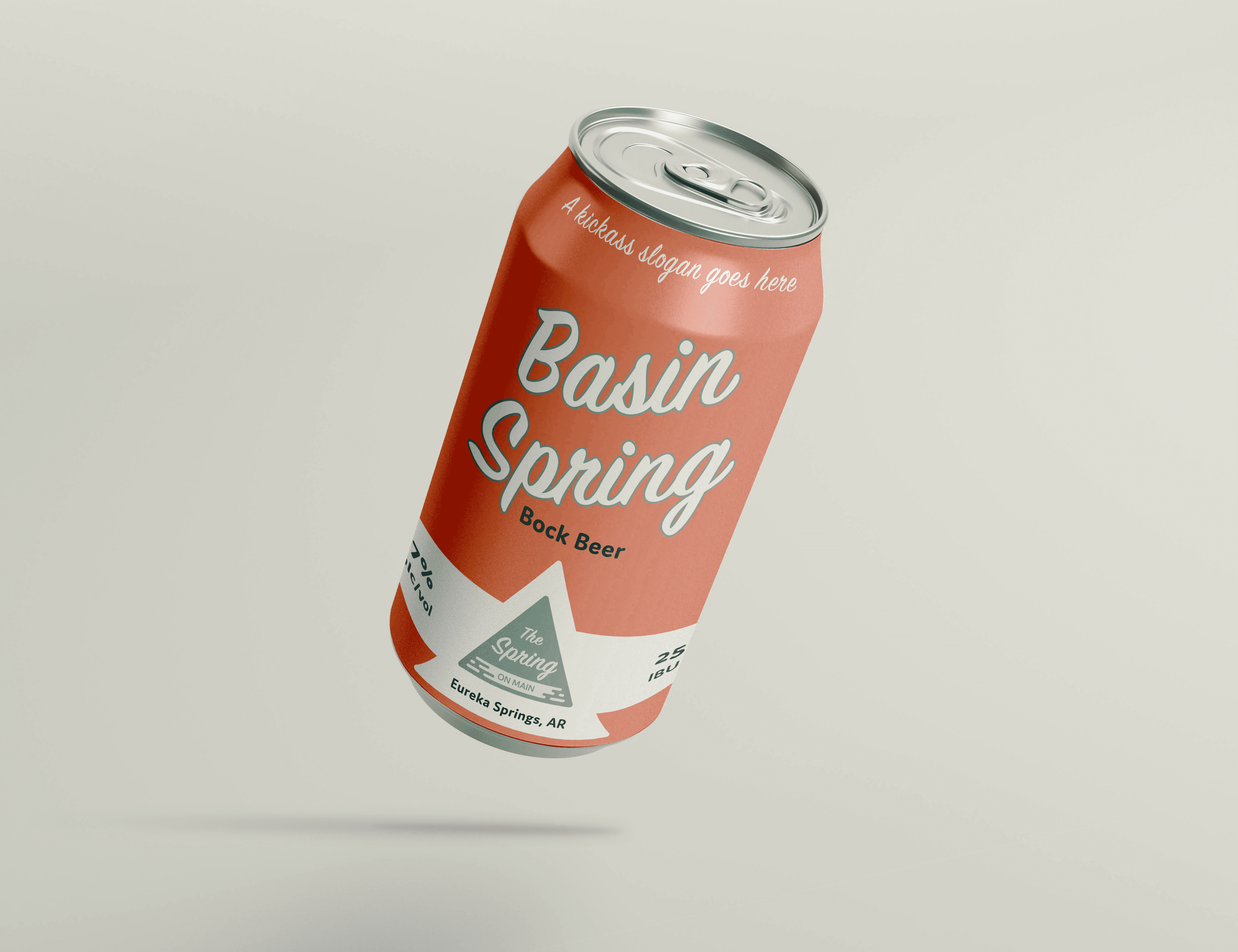
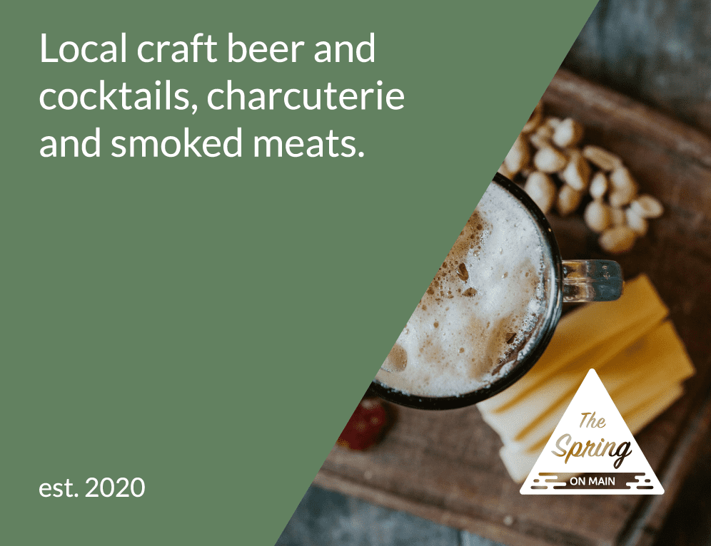
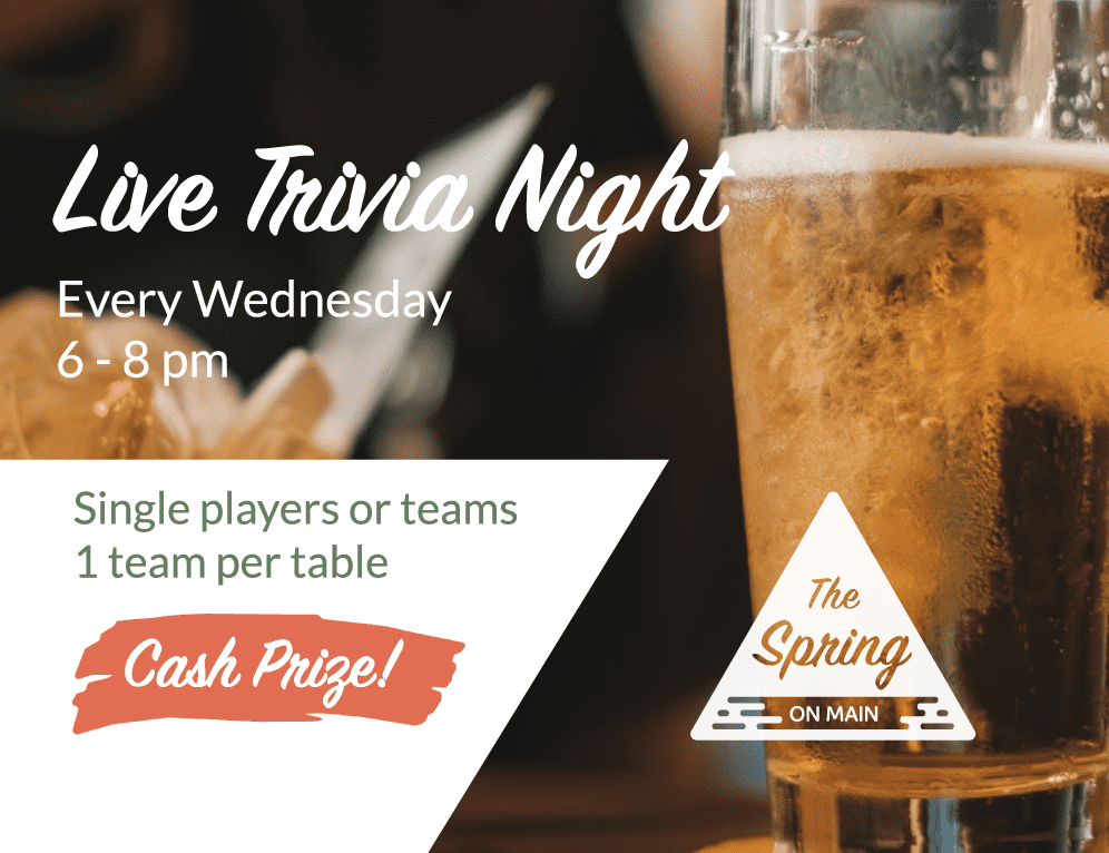
Applications
